Green Paw
Responsive design of an online plant shop for pet owners

Bringing the wrong plant into your home could be fatal to Fido

Photo from Freepik.com
Many common houseplants are toxic to cats and dogs if eaten, causing vomiting, seizures, and even kidney failure. If your pet likes to munch on anything leafy, shopping for houseplants is no walk in the park!
As part of my UX coursework at the School of Visual Concepts, I designed a website concept for “Green Paw,” an online store that only sells plants that are non-toxic to cats and dogs.
The assignment was to design a responsive website for both new users making a purchase and returning customers looking for product support. Since this was a solo project, I was responsible for designing all aspects of the experience and delivering a set of annotated wireframes at the end of the project.
- Interaction design
- Information architecture
- Usability testing
- Visual design
- Sketch + InVision
- Figma
- Pen + paper
Who’s shopping at Green Paw?
Pet owners shopping at Green Paw have the same questions as anyone else at a plant shop:
How much sun does this plant need?
What kind of soil do I give it?
What do I do if the leaves start falling off?!
They’re busy people and often start their shopping journey on mobile but finish it on desktop (or vice versa). Therefore they need a responsive website that’s consistent across devices.
Many of them are digital natives, preferring to buy their plants online rather than in-store. They’re familiar with major e-commerce sites and expect modern retail experiences, in both functionality and aesthetics.
Last but not least, they have a soft spot for animal videos!

Photo credit: Shelby Miller
What’s out there?
To kick off the project, I browsed through several plant shop websites. In particular, The Sill is an on-trend, online plant shop with a modern design. Its site offers:
Large, prominent photos to showcase plant offerings
Simple menus
The ability to filter plants by features, variety, and size
Simple icons that identify products as “pet friendly”
I also looked to Everlane and West Elm, two retailers with similarly modern website designs, to see what design elements they use to create a streamlined shopping experience.

I looked through the websites for Pistils Nursery, House Plant Shop, and The Sill.

To understand how West Elm organizes the elements of their site, I sketched a few different pages and menus from their site.
For the site design to be successful, it needed to achieve two things
1. Make sense to users
To continue using the site, users need to understand where they are, where they’ve been, and where to go next.
2. Help users achieve their goals
Green Paw’s users want to choose a plant and then keep it alive.
Making sense of site architecture
I began by creating a digital inventory of the content for this site, based on the products and content offered by other online plant shops. I then defined a site map that would encompass this content.
I also sketched a Green Paw concept model to make sure the navigation and interaction elements would work together to provide a cohesive experience.
I sketched this concept model for Green Paw to work through my information architecture questions.
Making sense of navigation
Because a seamless mobile-to-desktop (and back!) experience is important to Green Paw’s users, I first sketched and wireframed the main screens of the mobile experience. Once I had nailed down page elements on mobile, I adapted those screens to desktop.
Throughout the design process, I reviewed draft product pages and support pages before the homepage to ensure that a new user dropped onto a random page of the site could always figure out:
what site they were on,
where on that site they were, and
how to get to other parts of the site


Paper sketch (left), mobile wireframe (middle), and desktop wireframe (right) for a product page on Green Paw.
Helping users find the right plant
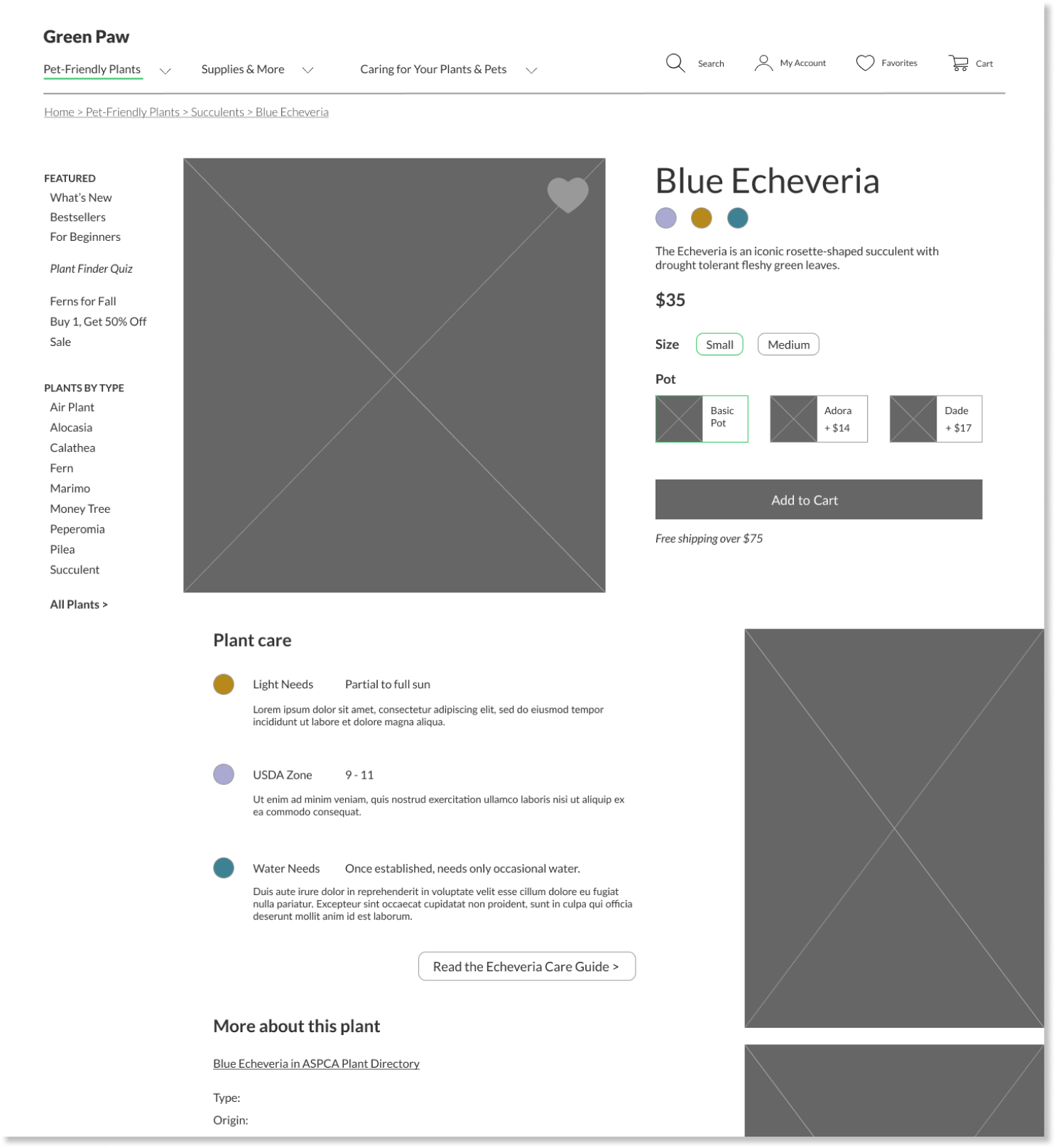
I introduced two types of icons to help users find and choose plants:
The favorite “heart” icon appears on each product thumbnail and product page. I promoted the My Favorites “heart” to the navbar so the user can return to their favorite plants from any part of their journey.

From the Succulents & Cacti category page, the user can tap the heart on any product to add it to their favorites page, accessible via the menu bar.
The plant attribute icons, displayed on each product’s page, help the user understand at a glance what they’re dealing with. Is this a plant for experts or beginners? How much light does it need?

The plant attribute icons appear immediately below the product name and are then explained in further detail below.
Helping users care for their plants
Since Green Paw’s users aren’t necessarily plant experts, the site should offer help for beginners — but they don’t have to stay beginners forever. I added opportunities throughout the site to help users grow their plant knowledge and keep their plants alive. Providing “support” content also gives Green Paw users a reason to return to the site!

I added opportunities on product category pages (left) and on individual product pages (right) for users to learn more about Green Paw’s plants and plant care.
But what did the users think?
I conducted usability testing on my mid-fidelity prototypes with five participants. Each session consisted of four tasks, three on mobile and one on desktop. Overall, the site was usable!
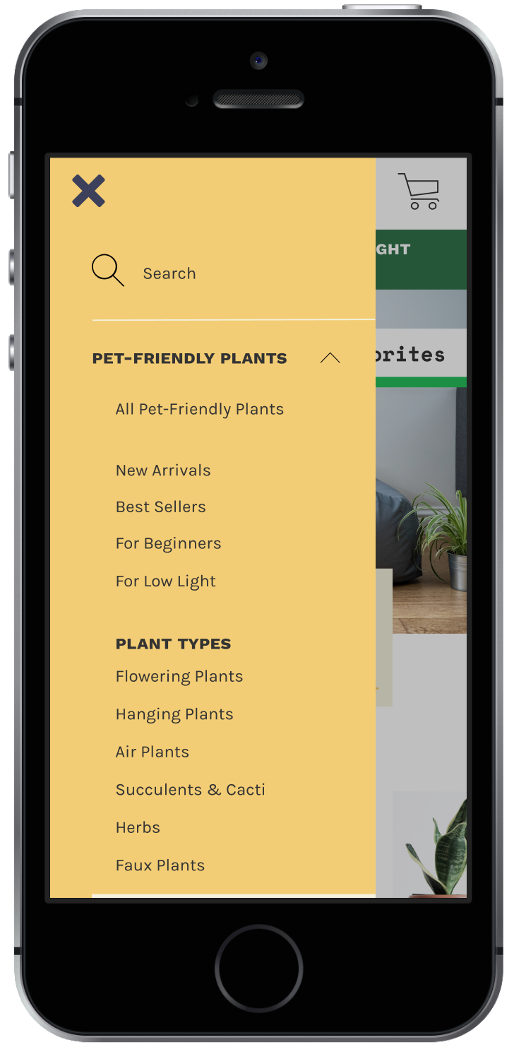
However, 3/5 participants struggled with navigating on mobile to a plant of interest and several participants mentioned that the home page felt very long. Reviewing my wireframes, I discovered that the plant categories were deeper than I realized on both the homepage and primary navigation.

In my mobile hamburger menu, the Succulents & Cacti option was buried below two accordion menus.

Do you see the Succulents & Cacti category? You had to scroll pretty far to get here - and that’s only halfway down the page.
Course feedback aligned with user testing results
At the end of the course, I delivered annotated wireframes describing Green Paw’s features on both mobile and desktop. I received this feedback on my work:
“Very thorough, thoughtfully developed, professionally depicted and articulated. Thumbs up for Green Paw!
[...] If you do further usability testing with this work, consider looking into potential issues of depth — in your mobile nav menu, perhaps, and in certain of your page designs, where there may be just a little too much of a good thing.”

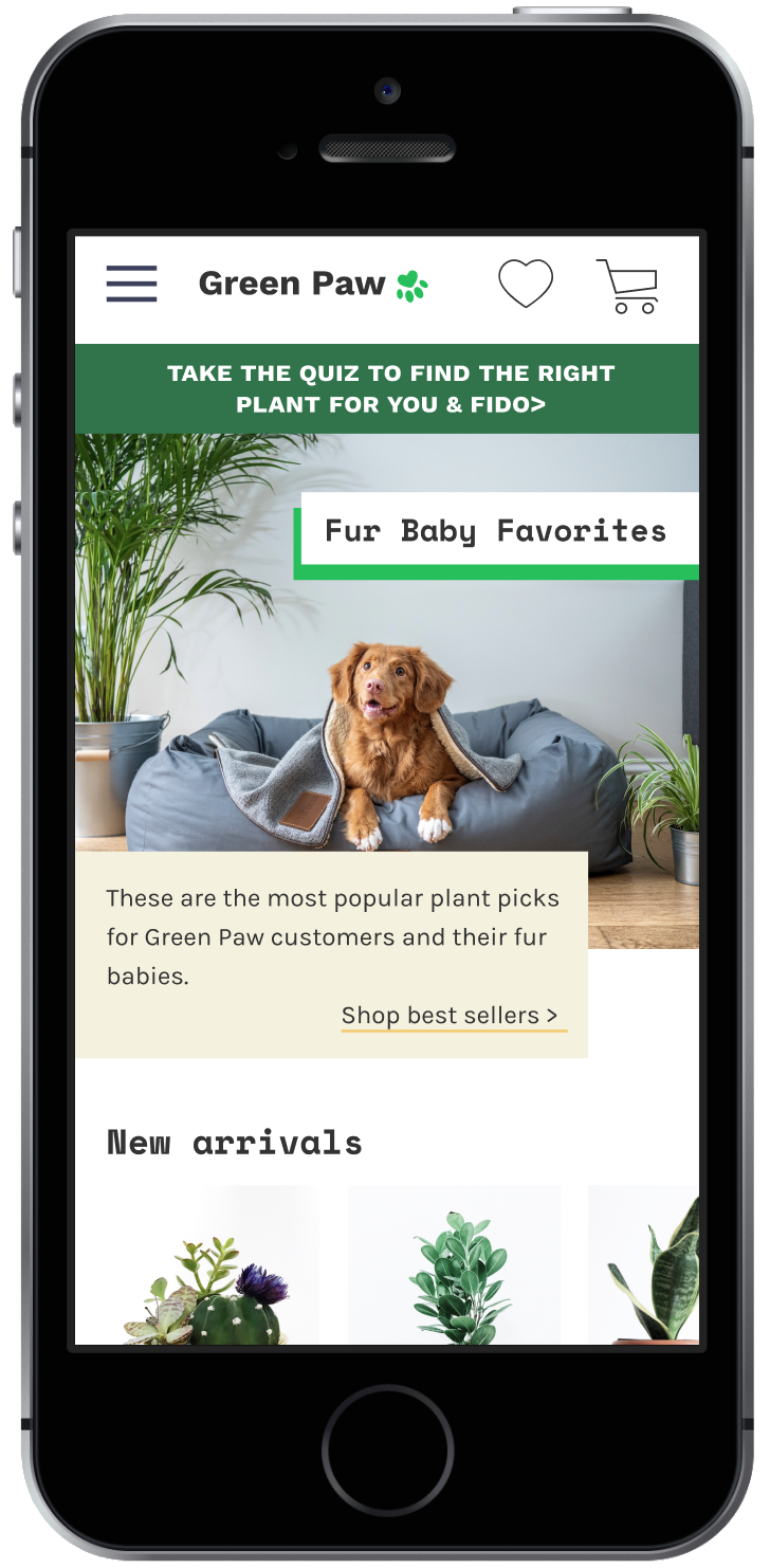
The final design of the homepage on desktop.
The final experience
As I started Green Paw’s visual design, I realized that I also needed to change the way that plant options are navigated. My prototype primarily organized plants by “Plant Type,” but if Green Paw’s users aren’t plant experts, how would they know what pilea or calathea are?
While creating the high-fidelity designs, I revised the “plant types” in the navigation and on the homepage to include categories that Green Paw’s users would realistically be interested in.

The updated plant type section on the homepage on desktop.
Lesson learned
During my competitive analysis, I focused on analyzing competitors’ interaction design. I should have paid more attention to the information architecture of these sites as well!
I also simplified the mobile primary navigation so that the user would only need to select one of the three category names to see all options within it.

If the user starts their journey from the homepage, they can use the hamburger menu to navigate (shown above) or any of the links on the homepage:

From the product category pages, the user can select products of interest:

On the product page, the user can add the product to their cart and learn more about the product:

Lastly, from the plant care guides, the user can learn more about the product they’ve chosen and navigate to other products:

How about now?
Now that the visual design for Green Paw is complete, the site is ready for another usability test with a series of plant discovery and findability tasks. I’d love to see whether the changes to the navigation and the visual design noticeably improve participants’ ability to find the plants they’re looking for.